

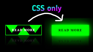
Button With Triangles
This is the HTML code: View Now
*{
	margin: 0;
	padding: 0;
}
body{
	display: flex;
	justify-content: center;
	align-items: center;
	min-height: 100vh;
	background: #000;
}
.form-demo-btn{
	color: #fff;
	position: relative;
	display: inline-block;
	padding: 15px 30px;
	border: 2px solid #0f0;
	margin: 40px;
	text-decoration: none;
	text-transform: uppercase;
	font-weight: 600;
	letter-spacing: 2px;
	background: #ff00;
	transition: .5s;
	-webkit-box-reflect: below 1px linear-gradient(transparent, #0004) ;
	overflow: hidden;
}
.form-demo-btn span{
	position: relative;
	z-index: 5;
}
.form-demo-btn:hover{
	color: #000;
	box-shadow: 0 0 5px #0f0,
                0 0 15px #0f0,
                0 0 60px #0f0;
}
.form-demo-btn span:before{
	content: '';
	position: absolute;
	left: 25%;
	bottom: -18px;
	width: 60px;
	height: 40px;
	background: #0f0;
	clip-path: polygon(50% 0%, 0 100%, 100% 100%);
	z-index: -1;
	transition: .5s;
}
.form-demo-btn:hover span:before{
	width: 100px;
	height: 100px;
	left: 8%;
}
.form-demo-btn:hover:before, .form-demo-btn:hover:after{
	width: 100px;
	height: 100px;
	right: -25px;
}
.form-demo-btn:hover:after{
	left: -25px;
}
.form-demo-btn:before, .form-demo-btn:after{
	content: '';
	position: absolute;
	right: 0;
	top: -1px;
	width: 60px;
	height: 40px;
	background: #0f0;
	transition: .5s;
	clip-path: polygon(50% 100%, 0 0, 100% 0);
}
.form-demo-btn:after{
	left: 0;
}